Biomilk™ // Package Design
Designing for the biological side of beauty.
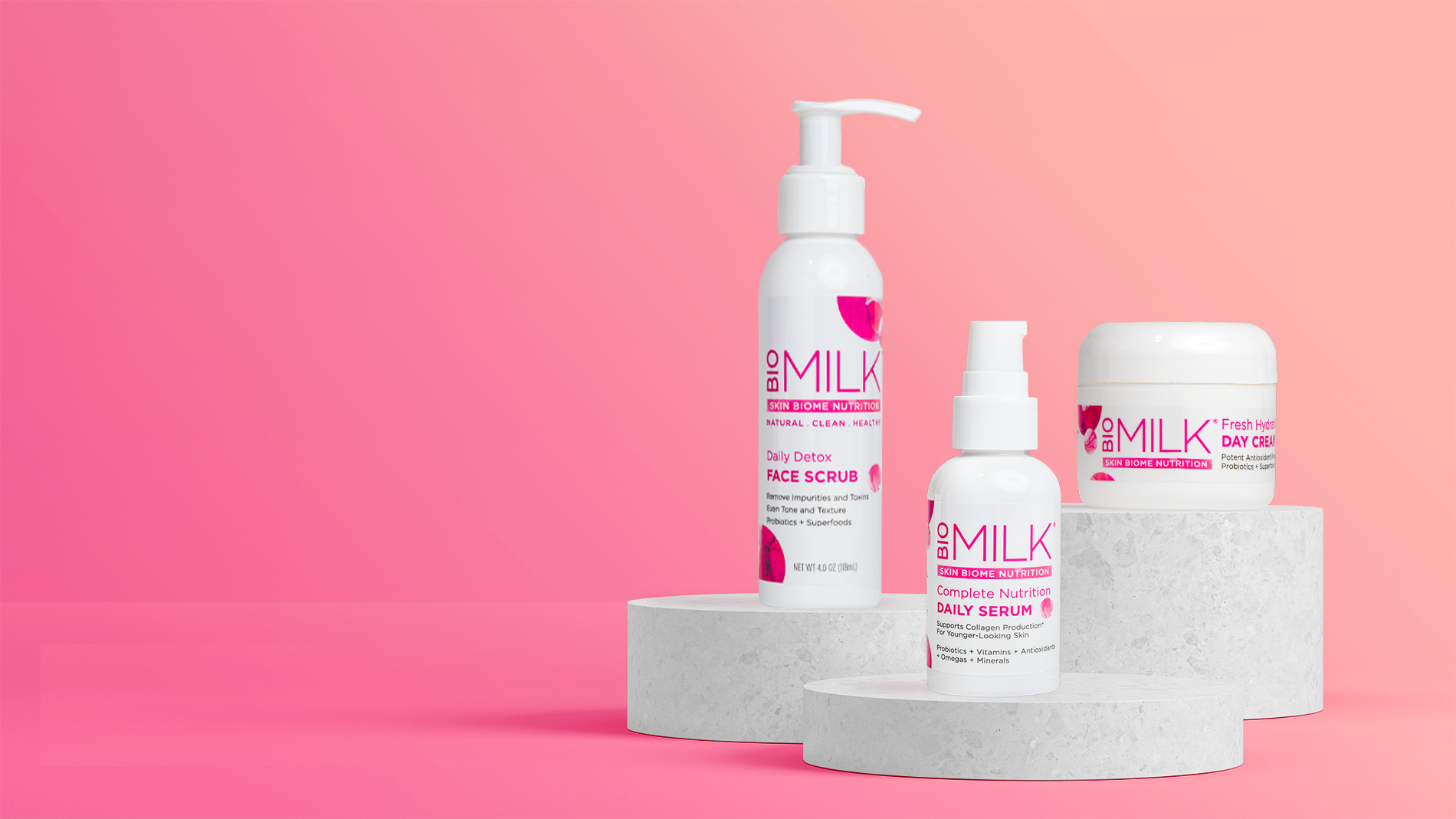
Biomilk pioneered probiotic and superfood skincare to support a healthy skin ecosystem. As consumer understanding is evolving from probiotics = yogurt, we had the opportunity to evolve the packaging away from prevalent milk cues and the copycat competitors to more sophisticated scientific and beauty cues.

The abstracted petri dish photography was the perfect way to elevate the scientific credentials, telegraphed the biome benefit, and signaled premium beauty cues—all without losing their shelf-popping bright pink color the brand was known for. The result is a fresh modern package that balances science with premium beauty.